
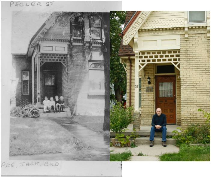
My house faces west, slightly oriented to the south. There are no large trees across the street to filter the light, so it gets intense, sunny exposure in the front from the early afternoon.
I wasn’t going to paint the brick, that was non-negotiable. I deeply dislike the color of the roof, which is sort of a rusty-brown ombre, but the expense of having the roof re-done seemed pretty outrageous as the shingles remain in good shape. This was a serious consideration in choosing paint colors.
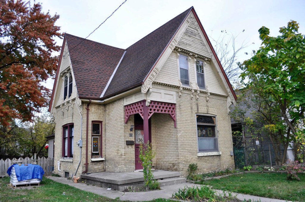
The yellow brick (or “white brick” as it was once locally known) has a lot of colors in it, which lean towards a vague acid green undertone, but also ochre, mustard, buff, plus the color of the mortar.
Many late 1800’s/early 1900’s yellow brick homes here have tasteful, subdued trim colors in sort of an inoffensive beige or taupe. When I heat stripped the worst areas, a very dark green almost black revealed itself as an original color around the windows. I also found traces of grey, a navy blue, a little red, and a brown that faded to oxblood and ochre. At some point everything was painted out to an approximate yellow-beige brick color, which is also a common house thing here, on both yellow and red brick houses of similar age.
I felt a multicolored paint scheme could accentuate the best features, but it had to be chosen and placed carefully, like successful make-up. Several high contrast colors on the embellished details looked tacky – like a color fistfight – as too many details fought for visual domination. The exterior has so many areas of interest – small, medium and large corbels, two types of decorative shingles, a repeating pattern in the gable pattern, those weird log things, plus two types of stained glass, dentile trim around the living room window, carved flower corners on the living room window plus incised lines and dots that were kind of Eastlake-something. Not only did I have to choose colors that would work with the brick and the roof, the colors had to work well as a community.
I am neurotic about color selection. I have baggies of paint chips from Benjamin Moore that I cut separately off their cards, so I wouldn’t be influenced by an adjacent color. For YEARS now I have taped up different combinations of swatches on different exterior walls, sat back, often for extended periods, contemplating that suite of colors. On sunny days, cloudy days, spring, summer and fall days. I have sat frowning at swatches for hours, probably days, cumulatively.
And mortifyingly – I made horrible choices, over and over !
There are a few local houses that I got color crushes on – a small house nearby with a fading blue-gray trim, another local house with original windows (now gone, replaced with vinyl crud) painted a very dark murky olive. An 1860’s building downtown looked sharp with that old fashioned dark green.
I love the trinity of yellow, blue and red – but the roof shingles forced those color choices into a brown-burgundy, and greyish blue, which I really didn’t like.
I bought many sample pots of paint, and even had a friend with a Phd Fine Arts degree attempt to assist me in choosing colors. Whatever was working in theory did NOT work in practice. That faded some-what army olive turned a bright avocado facing the western exposure. Ugh.
I tried reducing my color choices to only one color collection like the Historic paint color line.
I tried isolating the brick colors as a separate entity, and swore to not use brick colored paint.
In the first year I thought I had it figured out, and stripped and primed the porch and several ground floor windows. I chose BM’s “New London Burgundy” which seemed appropriate, a slightly dulled burgundy. In practice, simultaneous contrast asserted itself, making the yellow brick look more yellow, and the burgundy a ghastly purple.

It was horrible.
I kept trying. I tried numerous color combinations when the scaffolding was up. I gave into the dark green, trying two in succession. BM’s “Essex Green” won over “Black Forest Green” which was slightly teal. I weakened and tried a pretty horrible olive-brown green sample, similar to the house I liked, but the Essex Green won again.
One of the dliemmas was properly delineating areas so similar areas would not get painted the same color to merge into blob-like detail. Ultimately I had to break this rule, or introduce yet another color.
Even into the third weekend of lift rental I was second guessing my color choices, and brought some new contenders to the table.
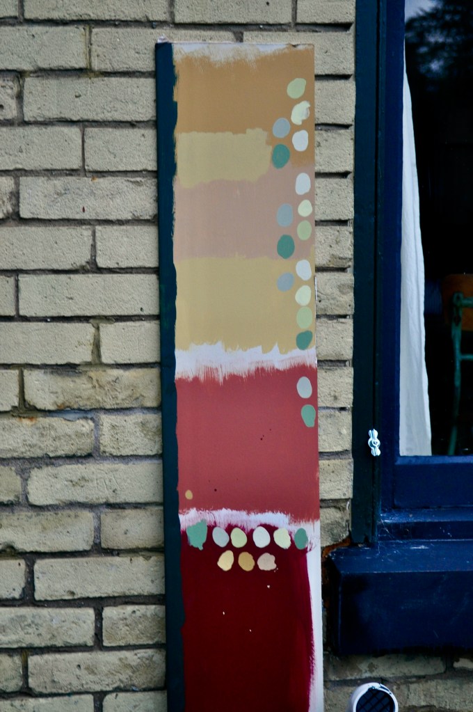
My color sample is skewing towards blue (overcast early evening light) but I was SURE that Cottage Red (at the very bottom), with Georgian Brick (next large swatch above it, actually more of a terra cotta color) with a couple of versions of ochres and other accent colors already in place on the house would work well.
IT DID NOT.
The Georgian Brick was far too light and orangey, the deep ochre on the top turned a hideous Cheez Whiz/fake butterscotch color and everything was wrong, wrong, wrong. I spent the 2nd weekend day painting out the first painting day’s grave errors.
I liked the Essex Green, there was a very changeable medium green – actually an interior color that had been on two room’s walls – and a more acid green green called Dill Pickle that seemed to be working well together. I had tried a lighter version called “Sesame” that looked too washed out, hardly visible as a color at all. Same with Abingdon Putty, which looked like nothing and Nantucket Grey – usually a very greenish grey turned towards blue. Was I doomed ? I wanted to use black in a small proportion, too.
I tortured myself for several years looking at a couple of the “Painted Ladies” books from the 1980’s – about colorfully painted victorian houses in the San Francisco area. The houses were a completely different style, so the rules – when I made them up – could not be practically applied.
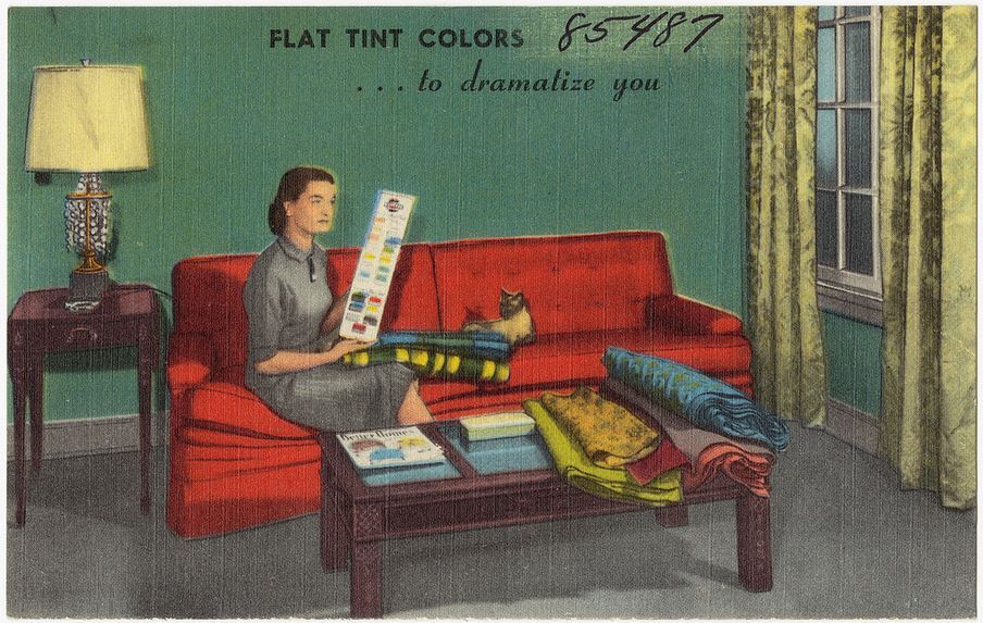
I was enthusiastic about odd, faded color combinations found in vintage print advertisements – which could not be well applied to my house with that ugly roof and difficult brick.

Did the house just not WANT to be painted ? Was I doomed to color purgatory on the lift, with the rental meter ticking, forever ?
